Dear moderator,
Thank you for looking at my blog! I hope you like my work. Please click onto the AL Research and Planning label in order to view my research and planning evidence.
Thank you :)
Makori (candidate 3233)
This blog is now closed.
Website

This is my site, click to view
Monday, October 21, 2019
Post 10: My production review
Feedback
Star Persona
My teachers were happy with my original star persona proposal, they liked the images I had chosen to show my character and thought the story for the artist was good. The main feedback I was given was just to include a social aspect, giving my artist having a cause or charity they believe in would be a good way to humanize them and therefore make them more appealing to audiences. I worked on this, making sure to talk about how he was from a working class background living with a single mother and wanted to help disadvantaged kids like he once was as a means to do good and give back.
I also listened to things they had said on accessories and even though I liked the sunglasses my star had, I felt that I could do more and so gave my artist a little chain to give him more character without taking away his down to earth persona.
I also listened to things they had said on accessories and even though I liked the sunglasses my star had, I felt that I could do more and so gave my artist a little chain to give him more character without taking away his down to earth persona.
Song Choice
My song choice was initially scrutinized by my teachers, who were worried the song would be too EDM sounding to be considered pop; however they thought if I would be able to perform it with enough energy it could work. After my performance bed was filmed, they thought the song was perfect for me and had no qualms about me using the song.
Performance bed and Narrative
There were no criticisms with my performance bed, so there were no additional performance shots or reshoots needed, however after coming up with my initial idea for my narrative, I received some feedback on things I should adjust. Firstly I was advised to film in a wider range of locations as most of my filming areas were initially suburban London, it would have been good to get some more urban, central shots in my video.
Editing
There was a shot where I was talking to my friends that made less sense after I changed the location of the previous shot to central London. To combat this issue I added in text to the video as a way to caption and anchor the video whilst not adding in any more audio to the song. I was also told that some of my shots were edited in a way that meant there was a substantial break between 2 shots of the same scene. This made it less clear that it was the same scene and meant the audience had forgot the original shot when going into the other one. I edited the shots much closer together to combat this issue.
After fixing all these things I was advised to make sure the grade was consistent across my whole video as well as making sure that there was some kind of promotion for the website and social medias to keep the video convergent with my artists site and social media pages.
After fixing all these things I was advised to make sure the grade was consistent across my whole video as well as making sure that there was some kind of promotion for the website and social medias to keep the video convergent with my artists site and social media pages.
Website
My site was the part of my project that received the most feedback suchg as my teachers informing me that my site didn't have all it's buttons leading to proper links or not having a dedicated charity section on the site despite mentioning it in my bio.
The site also wasn't formatted well for all screen sizes in some places, so I had to adjust it to make sure most features were within the safety lines. My peers gave me most of the feedback on the actual design of the website, being told to use a clear colour scheme and a consistent font choice, they also advised me to put my newsletter at the bottom of the page instead of in the middle of the page. After a complete overhaul of my main page I managed to implement all of these fixes as well as personal changes I felt were necessary, this meant my teachers had minimal advice to give me on the look of the site.
 |
| My final website feedback |
The site also wasn't formatted well for all screen sizes in some places, so I had to adjust it to make sure most features were within the safety lines. My peers gave me most of the feedback on the actual design of the website, being told to use a clear colour scheme and a consistent font choice, they also advised me to put my newsletter at the bottom of the page instead of in the middle of the page. After a complete overhaul of my main page I managed to implement all of these fixes as well as personal changes I felt were necessary, this meant my teachers had minimal advice to give me on the look of the site.
Post 9: My website and social media pages
There are various conventions that are similar across most artist websites. These are things I had to look at in order to make sure that my site looked like existing artist websites. After looking at around 15 websites, I could see what was common to all and therefore what my website needed:


 I looked at the website for the popular singer: Khalid, for inspiration on my own website. The first thing you see on his site, similar to many other sites is a looping section of his latest music video with a link to go to it. He takes a section of his videos with some of the more energetic, fast moving shots as well as a few of him to give people just finding out about him an idea of who he is. The video has many cuts, is prominent, plays automatically and loops, meaning there is minimal effort for those on the site and they can engage with the video as soon as the site opens.
The site contains a single page, scroll layout acting as another way to minimize effort needed for users to navigate the site. With the advent of modern smartphones and social media, scrolling is the main way of navigation for my 16-25 year old target audience, meaning this website layout is ideal. The site is also laid out with various strips as you scroll down, the different sections on the site being contained within their own box. Each box has a different colour or background, making the site appear full of life and eyecatching. The tour section features all dates and venues, his social media has 2 strips, there are strips with images showcasing his merch and albums and there is a slow-mo video strip of the Free Spirit short film. By making each strip different, the site is not at all monotone and means that nothing blends in with anything else; this is risky however as using such a variety of colours and imagery can look unprofessional and clunky if done poorly.
 The site contains all typical conventions on it, including a top bar even if it has a single page layout, with the sections on the bar taking you to different parts of the site. The site is clearly linked to his label through the RCA logo at the bottom of the page. There is also a clear push for his new album, with the "Free Spirit" album logo seen on the album cover, the world tour section, the short film, the merch and even having the same font for his single "Talk". This creates convergence and makes it clear that the site is themed around his new album, the other text used is a cool, bold, sans-serif font that is striking but not overly attention-grabbing.
These website features are all aspects I considered when writing my own site. I consistently used the bold Lulo Clean font for big titles and the Poppins Extra Light font for smaller text; both being sans-serif fonts so the site doesn't look too serious. The use of various bright colours was something I definitely borrowed from the Khalid website, as well as the horizontal strip style, which was something I saw on many different websites. I decided on blue and yellow as it evokes ideas of a relaxed summer, connoting the chilled, positive attitude of my artist.
The layout for the site was something I decided after looking at many different elements from various sites and putting bits from all of them together.
This video acted as a way for my audience to get to know my artist better as he answered "the webs most searched questions" about him. I also created a VANS collaboration as I had seen many other artists do similar things, this would be something likely requested by the label as it acts as another revenue stream for the artist/label.
- A logo for the band or artist

- A tour page or section where people can buy tickets to live shows


- A store page for various artist merchandise

- A top bar showing different sections
- A link to streaming for recent songs or albums

- A link to recent music videos, with a preview

- Social media links

- Label mentioned at the bottom of the page
 I looked at the website for the popular singer: Khalid, for inspiration on my own website. The first thing you see on his site, similar to many other sites is a looping section of his latest music video with a link to go to it. He takes a section of his videos with some of the more energetic, fast moving shots as well as a few of him to give people just finding out about him an idea of who he is. The video has many cuts, is prominent, plays automatically and loops, meaning there is minimal effort for those on the site and they can engage with the video as soon as the site opens.
The site contains a single page, scroll layout acting as another way to minimize effort needed for users to navigate the site. With the advent of modern smartphones and social media, scrolling is the main way of navigation for my 16-25 year old target audience, meaning this website layout is ideal. The site is also laid out with various strips as you scroll down, the different sections on the site being contained within their own box. Each box has a different colour or background, making the site appear full of life and eyecatching. The tour section features all dates and venues, his social media has 2 strips, there are strips with images showcasing his merch and albums and there is a slow-mo video strip of the Free Spirit short film. By making each strip different, the site is not at all monotone and means that nothing blends in with anything else; this is risky however as using such a variety of colours and imagery can look unprofessional and clunky if done poorly.
 |
| The many different sections on Khalid's site all with different colours |
These website features are all aspects I considered when writing my own site. I consistently used the bold Lulo Clean font for big titles and the Poppins Extra Light font for smaller text; both being sans-serif fonts so the site doesn't look too serious. The use of various bright colours was something I definitely borrowed from the Khalid website, as well as the horizontal strip style, which was something I saw on many different websites. I decided on blue and yellow as it evokes ideas of a relaxed summer, connoting the chilled, positive attitude of my artist.
 |
| The bright blue + yellow colour scheme of my site |
The layout for the site was something I decided after looking at many different elements from various sites and putting bits from all of them together.
 |
| My initial planned and annotated layout for my website |
Another thing I saw throughout my artist research, was how common it was for an artists website to feature extra content, ie competitions and brand deals, as well as links to interviews they have done. This gives audiences more content to view and more ways to connect with the artist. I created various extra things for my audience to view on my site; I firstly made a parody style video of the WIRED autocomplete interviews.
 |
| Louis Tomlinson's WIRED autocomplete interview |
 |
| My CABLED autocomplete interview |
 |
| Tyler the Creator x Converse collaboration |
 |
| My Nate x Vans collaboration |
My charity section on my website is a good way for my star to appear down to earth and gives him a real personality away from just creating music.
There are also behind the scenes clips and a competition page on my site as a little extra for the most die-hard of fans.
Social media is so important to an artists brand in the modern-day, it is how they advertise their products and interact with their audience. After looking at various pop star social pages I saw a few common traits which I wanted to include in my own pages.
My social media pages were Instagram and Twitter and featured content to ensure that there was convergence across both pages as well as links to my other media products. I did this by linking to my other media products on the social media pages and keeping the bio + profile pictures similar.
 |
| Little Mix becoming ambassadors for Rays of Sunshine |
 |
| My artist's partnership with The Childhood Trust |
There are also behind the scenes clips and a competition page on my site as a little extra for the most die-hard of fans.
 |
| Wireless fests free VIP ticket giveaway |
 |
| My VIP backstage ticket giveaway |
Social media is so important to an artists brand in the modern-day, it is how they advertise their products and interact with their audience. After looking at various pop star social pages I saw a few common traits which I wanted to include in my own pages.
 |
| Famous pop star Katy Perry's Instagram page |
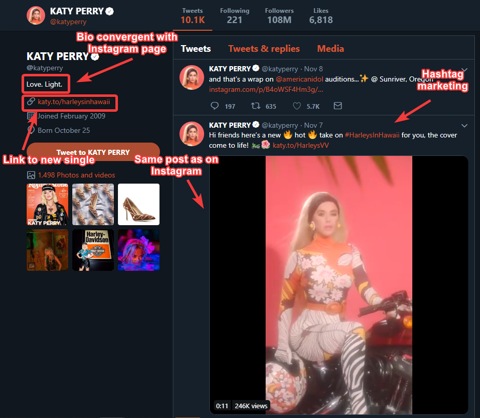 |
| Katy Perry's Twitter page |
My social media pages were Instagram and Twitter and featured content to ensure that there was convergence across both pages as well as links to my other media products. I did this by linking to my other media products on the social media pages and keeping the bio + profile pictures similar.
 |
| My Twitter promo for my autocomplete interview |
 |
| My Instagram promo for my autocomplete interview |
 |
| My Twitter profile |
 |
| My Instagram profile |
Post 8: My music video
When it came to planning out my own music video I decided to look at a wide variety of music videos for inspiration on what themes or effects to use for my own video.
 |
| A slow-motion, grainy section of the "how do you sleep" video |
 |
| The young/old transition in the Believer video |
- I looked at the "How Do You Sleep" video by Sam Smith, the main parts of it that stood out to me were the occasional use of slow-motion shots as well as the occasional shift from professional camerawork to square, grainy, retro footage
- The Shape of You video gave me a good insight into a video that shows 2 people getting closer, we see character development that one would not typically expect in such a short time frame.
- I looked at the Believer video for Imagine Dragons and was especially engaged by the use of flashbacks in the video, something that makes sense for a music video as they need not be in chronological order. The use of a younger version of the characters was also an especially unique addition, a very interesting way to show a time change.
- I liked the Ed Sheeran - Beautiful People video because of it's atypical story about feeling out of place, one that many people can relate to; this as well as the age and costume difference between the main characters and the other characters made the video humorous and memorable.
- The 5SOS - Teeth video caught my attention with its artistic use of lighting, different shots having different colours, and a lot of the shot being low lit and hard to see.
- The Dermot Kennedy - Outnumbered video created meaning in the video with shots where the camera simply zoomed in on one object and it's various scenic shots; giving real weight to every scene by slowing the video down to let the viewer really focus on it.
 |
| The effective zooms seen in the Dermot Kennedy - Outnumbered video |
- I liked the cool, group of friends vs the world idea I saw in the Ariana Grande - 7 Rings video, where we see them all just having fun with a very carefree attitude.
- The low quality, cheesy effects seen in the Ed Sheeran & Justin Bieber - I Don't Care video was a good way to give it a really personal, homemade touch; the video feels charming and grounded despite being made by 2 of the biggest artists in the world.
- The juxtaposing imagery of the Taylor Swift - You Need to Calm Down video such as cute things being lit on fire, made the video especially memorable.
 |
| The love song lyrics heavily juxtapose with the child truck heist seen in the video |
In the Dua Lipa - New Rules video, we see a story where the artist is the main character and she goes through a sequence where she learns to stay away from her ex-boyfriend, a direct translation of the song's lyrics. We then see her transition from being told these lyrics to telling them to someone else, this progression was very interesting to me and something I wanted to show in my video; it's like we're seeing the inspiration for the lyrics. This narrative was what I based my own video idea on, as I liked the story of a character going from being taught to being the teacher.
 |
| Dua Lipa being advised by the other characters |
 |
| Dua lipa advising another character |
When first coming up with an idea, I had to look at the songs lyrics and think of ways to interpret them, I went through a few ideas; one of a video showing various different people who feel alone/outcasted but eventually their real interests are revealed to us.
I then thought about a story where we follow a character through their whole journey where we see them progress from an introverted quiet person to performing their passion on a big stage


In the end though, I went with a different narrative that incorporated some of these ideas, a story of a boy being inspired to express himself by a busker he sees and then when his friends shut down his passion, he expresses himself anyway, filming a video and putting it up. This inspires his friends to do the same, with the story going full circle and showing how all it takes is one person to inspire others. This also acts as a sort of origin story as we see the boy go from a more normal look whilst being more reserved and quiet, to his final star persona look.
From this, I decided to start planning for the video. I first wrote down a number of ideas I had for the video. Once I had a basic plan, I decided to get various stock images from the web to help me visualize each shot and create a digital shootboard for my video.
 |
| Page 1 of my digital shortboard, this part of the idea stayed quite similar. In the final product however, my character doesn't start as much of an outcast as seen here. He also sees the busker before seeing his friends |
 |
| Page 2 of my digital shortboard, though similar to the final idea; I removed the idea of getting rid of the phone, as well as the idea that once he went back to his friends they were still against him. |
 |
| Page 3 of my digital shortboard, I decided to not just have 1 friend follow the protagonist and thought it would be better if the whole group was inspired. |
 |
| My initial, digital shootboard for my music video |
 I then presented my idea and was advised to use a few more locations from within London. This made me decide what interesting London locations I wanted to film at so I made a mood board of various interesting places in central London. After considering which one would look the most interesting as well as which would be the most realistic to do, I decided on filming at the Southbank skatepark as well as a shot of a busker in the hustle and bustle of Covent Garden market.
Using the feedback and a few ideas I had, I created a storyboard using post-it notes and drawings. Different colour post-it notes allowed me to see the variety of shot types from a macro glance.
 |
| My final storyboard for my video |
From this storyboard, I created my actual shootboards for the shoot day, containing details on who I wanted in each shot, what time I would be filming and what props I needed. I made separate props and location lists beforehand and then went on to find actors. I decided on my actors after deciding on my story, I knew I wanted a diverse cast and so I had 2 males and 2 females from different races, widening the video's appeal.
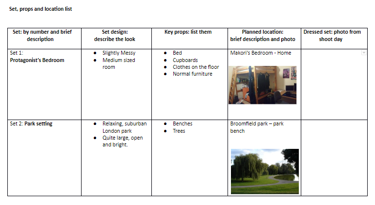 |
| Part of my location list, allowing me to lay out where I wanted to film beforehand |
 |
| My props list, some of which I replaced in the final video |
 |
| One of my shootboards, something I used to plan out each day's filming |
Overall, by planning all of these aspects it made the initial coming up with ideas easier as well as making sure the filming day went as smoothly as possible. Though not everything went to plan it was good to have a plan beforehand which I could adapt around if needed.
Post 7: My pop artist or band
The current look in pop is difficult to nail down, with so many different artists taking up the modern pop scene. Whether that be artists wearing surprisingly bright colours, artists wearing expensive jewellery and chains, tattoos on an artists body or even face or in some cases just looking the exact same as anyone else.
These different looks all seem to depend on the artist and the brand values they are trying to present, artists wanting to be seen as fun or eccentric will wear more unsophisticated, pastel coloured clothing.
Some artists will have a brand of being cool and rich, through their designer clothes and expensive jewellery. These are typically larger more mainstream artists who are presenting themselves in a more idealistic, aspirational way to their audience. This can in turn alienate some audience members due to the disconnect people often feel with these artists.
Many artists like to present themselves as more alternative and edgy, getting various tattoos and dressing in dark clothing. This helps audience members feel like the artist is more genuine, not trying to fit the typical mould of a pop artist. It also means those that don't feel they align with the often over the top rose-tinted glasses positivity of many artists are more drawn to artists like this.
But on the whole, the most common style is one of these elements incorporated with a relatively normal outfit, most artists simply dress like everyone else but with a certain feature or part of their outfit accented to make them stand out just that little bit. This means they get the uniqueness of these looks without alienating their audience.
An artists star persona is also a major part of their identity. Some artists wanting to be seen as cool and mysterious and so opt to hide their true identity under a mask. Some may want to be seen as "weird" and extravagant and so will do shocking things that garner media attention. Often artists will want to be viewed as unapologetically honest and so will say whatever comes to their minds even if it makes them come across negatively to the general public; whilst some artists will be very positive and will stay away from controversial topics.

I decided to go with the down to earth, colourful look artists like Rex Orange County have. I wanted to give my star this look to present him as a more normal guy whilst still giving him a bit of character. I also wanted to wear sunglasses and a small chain, to help my artist appear cool and aspirational without appearing too boastful. This can mostly be seen in the performance bed of my video but it can be slightly seen through my video where my artist tries on various ridiculous outfits before deciding on his final look. This relates to the idea of the song, being all about being yourself and not doing things just to look cool to other people, this is why I felt a more toned-down look would work well. The Vans & Converse shoes are also good as they present my star as someone who isn't entirely clueless about major brands but doesn't buy into the overpriced designer clothes many people wear for bragging rights.


 |
| This very over the top bright aesthetic has been most popularised by Tyler the Creator |
These different looks all seem to depend on the artist and the brand values they are trying to present, artists wanting to be seen as fun or eccentric will wear more unsophisticated, pastel coloured clothing.
 |
| Rapper Lil John's loud in your face performance is complimented with his huge, $500,000 chain |
Some artists will have a brand of being cool and rich, through their designer clothes and expensive jewellery. These are typically larger more mainstream artists who are presenting themselves in a more idealistic, aspirational way to their audience. This can in turn alienate some audience members due to the disconnect people often feel with these artists.
 |
| Artist Lil Peep blurred the lines between rap, pop and emo rock in his music; with his grungy aesthetic showing these influences |
But on the whole, the most common style is one of these elements incorporated with a relatively normal outfit, most artists simply dress like everyone else but with a certain feature or part of their outfit accented to make them stand out just that little bit. This means they get the uniqueness of these looks without alienating their audience.
 |
| Pop artists who dress in the above 3 archetypes in a more typical, toned down way |

A common part of an artists brand is the good deeds they do or charities they support. When an artist supports a charity it makes them seem more real and aspirational, it shows them to have real moral values and so audiences like them more.

 |
| The final mockup of my star's image |
 |
| Me in my star clothes |
My artist's persona is one of a non-controversial, cool, laid back guy; he isn't the kind of person who would do something simply to stir up drama or draw media attention. He's someone who makes music because he likes doing so and likes how much it helps others.

This is reflected in the website colour scheme, the abundance of smiley photos on the website and social media pages and the involvement with charities featured on the website.
Nate is a character who started out from a poor background with just him and his mother, creating both an underdog story that audiences would be able to sympathise with. As well this, it gives him a clear reason to so clearly feature the charity he is supporting, The Childhood Trust; a London based charity dedicated to helping child poverty.
To plan out my star persona, I wrote an entire character profile at the start of the project and got feedback on it from my teacher and my class. I used this profile to guide my future decisions as well as for creating an artist bio on my artists "Extras" page.

Subscribe to:
Posts (Atom)