Dear Moderator,
Thank you for looking at my blog. To find my research and planning evidence, click on the label called AS research and Planning, which is on the right side of my blog. I hope you enjoyed reading my blog and thank you.
Makori (3233)
This blog is now closed
Website

This is my site, click to view
Friday, December 14, 2018
Blog post 21: My finished adverts
I was very pleased with how my adverts turned out in the end. With my initial ideas being seen through all the way to the end of the project. I was happy with how the videos looked; with the colours, pacing, transitions and graphics looking professional in the final version of my adverts.
The process was a long one, with hours of time spent over many weeks planning, organizing, shooting and editing them. The end result showed me that it was worth putting in this time as I was pleased with how both my advert and my own skills had improved over time.
My final ad 1
My final ad 2
The process was a long one, with hours of time spent over many weeks planning, organizing, shooting and editing them. The end result showed me that it was worth putting in this time as I was pleased with how both my advert and my own skills had improved over time.
Blog post 20: My target audience feedback
I made sure to get audience feedback so I could assess how well my adverts had turned out with my target audience. Just to check basic things such as seeing whether my adverts made sense and came out as intended with my target audience.
I asked 2 males and 2 females, 2 of which were 17 and 2 of which were 16.
I asked them over the internet, messaging them all the questions and getting their responses individually.
These were my results for the questions I asked:
Did you like the advert you just watched?
Yes, it was funny
Yeah
Did you understand the story of the advert, what was it about?It was about a couple who couldn't get Breakfast and ordered it from Your Food.
From this I learned that my adverts intended message came through to my audience, the jovial tone of the advert was clear and it appealed to the audience. However I will take into account the feedback and would have spent more time finding music as well as possibly altering the pacing.
I asked 2 males and 2 females, 2 of which were 17 and 2 of which were 16.
I asked them over the internet, messaging them all the questions and getting their responses individually.
These were my results for the questions I asked:
Did you like the advert you just watched?
Yes, it was funny
Yeah
Yes
Yes
Did you understand the story of the advert, what was it about?It was about a couple who couldn't get Breakfast and ordered it from Your Food.
A couple woke up and didn't have any food so they ordered it in
The couple didn't have any breakfast and got it from the delivery company
2 people who didn't have breakfast so ordered it in
Did you understand the product being advertised, what was it?
Your food
Did you understand the product being advertised, what was it?
Your food
The delivery app Your Food
your food
Your food delivery
Would you say this advert would appeal to people your age, what about it?
Yes it would because it's funny
Would you say this advert would appeal to people your age, what about it?
Yes it would because it's funny
Yes, it has actors who are our age
Yes it does because it's clearly advertising a food app which would appeal to people our age.
Yes, it's funny
Is there anything you would change, if so what?
Is there anything you would change, if so what?
Not really
nope
maybe make it a little faster paced
better music
 |
| The answers of a 17 year old male I asked |
 |
| The answers of a 16 year old female I asked |
From this I learned that my adverts intended message came through to my audience, the jovial tone of the advert was clear and it appealed to the audience. However I will take into account the feedback and would have spent more time finding music as well as possibly altering the pacing.
Blog post 19: My Adverts Review
I did this in order to get checks on my final product for any minor changes that I needed to fix before publishing the adverts as my final versions. This was helpful as it just helped tweak any small changes not previously noted until we started especially looking for problems with our adverts.
We first had to upload a review copy of our ads to YouTube for this review:
I only had minor changes to make being:
This was ultimately very beneficial to my project which made sure I was happy with my final adverts, with no worries about whether or not there were serious problems with the ads. I only had to change some minor things such as making sure the end title filled up the screen more as well as making sure the audio didn't cut off at any point
We first had to upload a review copy of our ads to YouTube for this review:
I only had minor changes to make being:
- making sure audio at the end didn't cut off
- larger end title
- Adjusting grading in places
This was ultimately very beneficial to my project which made sure I was happy with my final adverts, with no worries about whether or not there were serious problems with the ads. I only had to change some minor things such as making sure the end title filled up the screen more as well as making sure the audio didn't cut off at any point
Blog post 18: My rough cut
We decided to do a rough cut after the first weekend on premiere using the footage we had filmed the weekend before. This allowed us to watch through our footage in the context of our whole adverts and understand what had problems or what was fine to keep. Reshoots the following weekend were mainly based on these rough edits.
From this I found out what I wanted to change.
In my first advert I wanted to adjust some of the mise en scene of the breakfast shots, making sure there were spoons laid out on the table when they sat to eat. To further show that the ad is set in the morning I decided I wanted my actors to wear proper pyjamas for the actual shoot and to wear their outdoor clothes for the car shot onward. I then decided to film the car shot more from the front as well as I figured this would look better. I also figured I would adjust the pacing on the final pancake shot and quickly pan to her looking at the pancakes.
I wanted a generally faster pace for the second advert with a more upbeat, energetic voice-over. I also wanted a shot of my actor opening up the burger box and eating it, as well as making sure the bag the food came in was properly branded. I framed the shot of the delivery itself through a window as there was little space, however I planned to redo this shot and make sure the camera had enough space to give a better shot. The rough cut also showed me the importance of de-cluttering your shot, which made sure to do in my final advert.
This was almost like a second practice advert however it was much more useful as many of the technical limitations we had for the previous shoot were fixed by having the proper cameras and editing software meaning we had full focus on the content of the shots themselves. Many of things were also done in this rough cutting stage making the final edit take a lot less time as we didn't have to completely start from scratch.
My rough cut for my 1st ad
My rough cut for my 2nd ad
From this I found out what I wanted to change.
In my first advert I wanted to adjust some of the mise en scene of the breakfast shots, making sure there were spoons laid out on the table when they sat to eat. To further show that the ad is set in the morning I decided I wanted my actors to wear proper pyjamas for the actual shoot and to wear their outdoor clothes for the car shot onward. I then decided to film the car shot more from the front as well as I figured this would look better. I also figured I would adjust the pacing on the final pancake shot and quickly pan to her looking at the pancakes.
I wanted a generally faster pace for the second advert with a more upbeat, energetic voice-over. I also wanted a shot of my actor opening up the burger box and eating it, as well as making sure the bag the food came in was properly branded. I framed the shot of the delivery itself through a window as there was little space, however I planned to redo this shot and make sure the camera had enough space to give a better shot. The rough cut also showed me the importance of de-cluttering your shot, which made sure to do in my final advert.
This was almost like a second practice advert however it was much more useful as many of the technical limitations we had for the previous shoot were fixed by having the proper cameras and editing software meaning we had full focus on the content of the shots themselves. Many of things were also done in this rough cutting stage making the final edit take a lot less time as we didn't have to completely start from scratch.
Blog post 17: My shoot-board
I made the shoot board in order to collate all the other parts of planning we had done previously. Storyboard, location reccie, time plan, crew and cast list all came together on the one sheet, making this possibly the most important piece of planning for the filming days themselves.We made them on microsoft word, using a table template which we filled in. Each shot number sat alongside a picture of the shot, the actors and props we were using, the time we planned to film it as well as an empty number of shots/best shot column which we would fill in on the day.

It meant that the whole process took a lot less time, as everything we had planned for the advert was already set out. There was no need for us to come up with or improvise much of the process, resulting in an overall much more polished advert.
 |
 |
| My shootboard for one of my adverts |

 |
| My shootboard for my other advert |
It meant that the whole process took a lot less time, as everything we had planned for the advert was already set out. There was no need for us to come up with or improvise much of the process, resulting in an overall much more polished advert.
Blog post 16: My kit list
I already knew how important the kit list was. Doing previous projects I realized how many pieces there are when putting together a shoot and how easy it is to lose something when packing away. Remembering to check the kit list proved very helpful and meant we didn't misplace or lose any (possibly very expensive) kit.
This process also generally took away more stress from the filming days as we already had a lot to think about and so this meant we had a lot less things to remember on the day.
 |
| The kit checklist we were given on the filming weekends |
This process also generally took away more stress from the filming days as we already had a lot to think about and so this meant we had a lot less things to remember on the day.
Blog post 15: My time-plan, crew and cast list
This was done in order to help me manage my time on the day. This was especially important to me as I had previously on the rough shoot not been able to film all of my desired shots in the small amount of time I had. By having a time plan it meant we knew roughly from and when the shoot as a whole would take, making sure everything was accounted for. The crew and cast list helped me pin down the help I would be getting on the day, for both acting and crew help.
This was beneficial to me and meant the day was easier as we had a plan which we could follow. Although everything didn't go exactly to plan, by having something to follow it meant we only slightly deviated from the schedule meaning we still got everything done in the time. The crew and cast list also meant that everyone knew what they were going to do and there were no surprises for any of us.
 |
 |
| The time schedule I used before I incorporated it into my shootboard |
This was beneficial to me and meant the day was easier as we had a plan which we could follow. Although everything didn't go exactly to plan, by having something to follow it meant we only slightly deviated from the schedule meaning we still got everything done in the time. The crew and cast list also meant that everyone knew what they were going to do and there were no surprises for any of us.
Blog post 14: My location reccie, risk assessment and location permission
I did all of these things in the lead up to my actual shoot. This was done in order to make filming go as smoothly as possible; ie so that any risks were accounted for, I was definitely allowed to film in these areas and to make sure the location was prepared for our filming. I took these photos and it helped me identify how suitable these locations would be for the final shoot. They were both perfect for what I had to do, being fairly large clean good looking houses which were plausible for our characters to live in. The risk assessment was done by me as I thought of all the realistic and fairly likely situations that could occur.I was given verbal permission to be allowed to film in both of my locations as well as my friend messaging me to give permission


This was helpful to the filming process as it meant that there were no surprises when it came to actually filming. All the locations looked great for filming on the day, there were no serious accidents which happened on the day and I was allowed to film in all of the locations I had agreed to on both weekends. If I hadn't done this I may have had a lot of easily avoidable problems and would've meant I couldn't focus on the important things of the day

Reccies of my location
 Sam's house exterior,Walthamstow |
Outside area with a quiet street and many houses. Can place the camera both on the pavement and in the street (whilst being wary of occasional cars). No need to watch out for pedestrians interrupting shots and no dressing needed. |
 Sam's kitchen area,Walthamstow |
Large kitchen, with space to put the camera outside filming into it; or from the kitchen area out into the rest of the house. Slight de-cluttering of the area will serve as appropriate dressing. |
Blog post 13: My practice shoot/edit
I did this practice shoot in order to get an idea of how easy it would be to film the actual shoot. We went about this by filming and editing with our phones. This overall made this version a lot more amateurish as well as many things in this version that weren't in the actual version, with a change in actors, settings and props across the trailers.
This was overall very beneficial to my final project with the things I did wrong helping with my final product such as me forgetting to buy real food the day before the shoots as well as helping me realise the importance of getting enough footage before and after a shot. I also had to learn to manage my time better in order to make sure all my shots were filmed the second time around as I wasn't able to film 2 of the shots in my test shoot. There were also many additions I realised my ad needed such as sound effects, better pacing, different shot order as well as the addition of the delivery process in one of my adverts.
My first practice shoot advert
My second practice shoot advert
This was overall very beneficial to my final project with the things I did wrong helping with my final product such as me forgetting to buy real food the day before the shoots as well as helping me realise the importance of getting enough footage before and after a shot. I also had to learn to manage my time better in order to make sure all my shots were filmed the second time around as I wasn't able to film 2 of the shots in my test shoot. There were also many additions I realised my ad needed such as sound effects, better pacing, different shot order as well as the addition of the delivery process in one of my adverts.
Blog post 12: My advert storyboards
I created my advert storyboard to give an idea of how my advert would look as descriptions can only show so much. I went about this by getting a large piece of A3 paper and sticking various post its on it, with each on representing a different shot. I then wrote the dialogue under each post it as well as character movement and camera movement on which ever shot it applied to.
I mainly referenced my storyboard and initial concept notes when creating my storyboard as these had my ideas already there. I looked at previous storyboards I had made in a similar fashion in order to get an idea on how I would lay out my own.
This was beneficial as it allowed me to see how each shot would be framed as well as the actions of those within the shot so I could better see how realistic my shots were when I really saw them drawn out. This all helped me frame my shots and direct my actors into their correct positions when it actually came to filming.
I mainly referenced my storyboard and initial concept notes when creating my storyboard as these had my ideas already there. I looked at previous storyboards I had made in a similar fashion in order to get an idea on how I would lay out my own.
 |
| My first shootboard |
 |
| My second shootboard |
Blog Post 11: My advert's soundscapes
I used royalty free music for my advert, going to a source of quality, free and non-copyright music I already knew of: www.Incompetech.com. I found a piece of music that was fairly minimalist and light-hearted called "Kool Kats" and decided to use that for both adverts. The piece had no blaring instruments or lyrics that would distract from the voice over or dialogue in the advert itself.
Most of the sound effects such as the various "wooshes" were done by voice in order to make sure they were original where possible. For some sound effects, I found royalty free effects online after looking for a while to provide diegetic sound to my car startup and beeping scenes, something common to most of the adverts I had looked at to give the ads more energy. I also made sure when mixing the audio to turn all the music down and turn all the voices and sfx up to make sure the music wasn't to overbearing, as this was a convention true to all ads I saw. The voices in my trailer came purely from narration, I wrote my script for both ads beforehand as can be seen here:

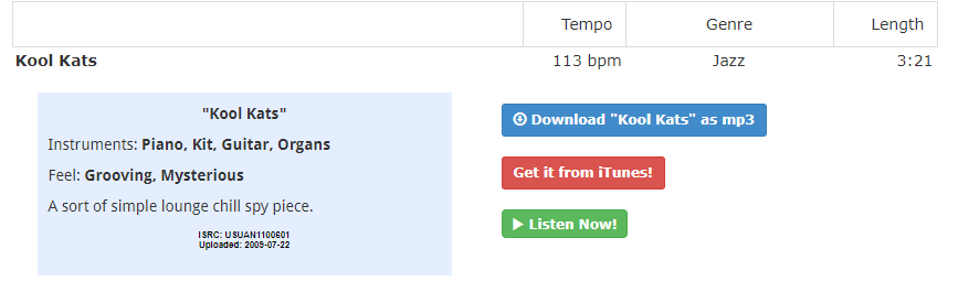 |
| The download page on Incompetech for my adverts music |

The use voiceover in this way was due to other adverts I had seen which use narration and miming actors to create comedy such as in this McDonald's advert:
Blog Post 10: My branding
When making the branding I needed to make something that would be eye catching yet original. I initially thought about going for an icon however settled on a text logo, with an overall orange colour scheme. This was the plan I made for my various YourFood logos:

I designed the logo in Photoshop and used the Bulletto Killa font, I put an orange stroke and gradient effect on the text to make it look bright and stand out. This approach meant that the logo was completely designed by me, using no pre-existing images or logos to make my own. I based my logo on other modern, simplistic text based logos such as the oreo logo:
My bright, vibrant colour scheme was based on the one for Europe based food delivery service: Takeaway.com.
I kept this branding consistent when designing the app UI in which i used a app design template but changed it to match my own vision. This meant adjusting the text colours and iconography on the app to make it entirely personalised to my ad; I made multiple different app screens for different parts of my advert. I made the branding consistent across both ads as well as on the prop food packaging for my advert to keep synergy across both. Both my adverts had very simple on screen text at the very end , subtitling the slogan of my brand: "all day, your way, YourFood".

I designed the logo in Photoshop and used the Bulletto Killa font, I put an orange stroke and gradient effect on the text to make it look bright and stand out. This approach meant that the logo was completely designed by me, using no pre-existing images or logos to make my own. I based my logo on other modern, simplistic text based logos such as the oreo logo:
| The style of logo I based mine on |
My bright, vibrant colour scheme was based on the one for Europe based food delivery service: Takeaway.com.
 |
| The Takeaway.com logo |
| My Brand logo |
I kept this branding consistent when designing the app UI in which i used a app design template but changed it to match my own vision. This meant adjusting the text colours and iconography on the app to make it entirely personalised to my ad; I made multiple different app screens for different parts of my advert. I made the branding consistent across both ads as well as on the prop food packaging for my advert to keep synergy across both. Both my adverts had very simple on screen text at the very end , subtitling the slogan of my brand: "all day, your way, YourFood".
Blog post 9: My advert timelines
I went through creating my advert timelines by getting an A3 piece of paper and sketching out 2 timelines on it in order to make a timeline of events when creating my advert storyboards. I had to decide how best everything flowed together as well as getting a rough idea on timing of shots so that everything fits into the 30 second ad time.
When designing the timeline I mainly looked at my already created simple voiceover and figured out how to plot it out onto my 2 timelines. I looked at my previously made timelines in the past in order to get more inspiration on how to design them effectively.
This was overall very beneficial to my project as it showed me the importance of timing in these adverts as you must fit everything to a 30 second window. It also showed me the importance of a simple advert concept as I had to be able to describe all my shots clearly. This meant that when it came to drawing out my concepts it wasn't too difficult for me to draw.
When designing the timeline I mainly looked at my already created simple voiceover and figured out how to plot it out onto my 2 timelines. I looked at my previously made timelines in the past in order to get more inspiration on how to design them effectively.
 |
| My timeline |
This was overall very beneficial to my project as it showed me the importance of timing in these adverts as you must fit everything to a 30 second window. It also showed me the importance of a simple advert concept as I had to be able to describe all my shots clearly. This meant that when it came to drawing out my concepts it wasn't too difficult for me to draw.
Blog post 8: My initial proposal
When starting creation on my advert I decided I liked the idea of a voice-over lead advert from adverts such as the MoneySuperMarket adverts and so I decided I would do that. I wanted to come up with a unique concept surrounding this and made some notes on what I planned to do in order to get my basic idea down.
At the start my idea seemed too long but I quite liked the concept. It was an advert focused on someone with an overall boring life who eats the same boring food every day but then goes into a scenario where his life is much more interesting and so is his food; until finally concluding with the fact he can't change everything in his life but he can spice up his food with YourFood.
I had a similar idea with my second advert which featured a couple who had a terrible day but then they redo the whole day, this time where everything goes right, until the advert finally says you cant go back in time but maybe they can do it right tomorrow.
These adverts proved much too long with the idea of going back and redoing the day in a better way meaning almost 2 ads had to be made in one 30 second ad space. Many things were changed but the general concepts of the man who has a boring life and the couple who had a bad day which is all improved by YourFood, stayed until the final product.
My idea always made sure to stick to the brief, with the planned use of 17 year old actors in situations that young people from ages 16-25 would all be able to relate to. I planned to have a similar theme across both adverts as well as consistent branding in order to create synergy between them and I planned to create a tagline which I would use for both adverts.I wanted to use the voice-over to create humour to engage the audience and make the adverts memorable.
I found this process helpful and they overall allowed me to create a fully fleshed out advert concept based on these ideas. I had not yet decided on my slogan, the exact voice over dialogue, my actors or my music but I had an idea created which I could work from.
An advert with a comedic voice over in the same style I planned to do for my advert
At the start my idea seemed too long but I quite liked the concept. It was an advert focused on someone with an overall boring life who eats the same boring food every day but then goes into a scenario where his life is much more interesting and so is his food; until finally concluding with the fact he can't change everything in his life but he can spice up his food with YourFood.
I had a similar idea with my second advert which featured a couple who had a terrible day but then they redo the whole day, this time where everything goes right, until the advert finally says you cant go back in time but maybe they can do it right tomorrow.
These adverts proved much too long with the idea of going back and redoing the day in a better way meaning almost 2 ads had to be made in one 30 second ad space. Many things were changed but the general concepts of the man who has a boring life and the couple who had a bad day which is all improved by YourFood, stayed until the final product.
My idea always made sure to stick to the brief, with the planned use of 17 year old actors in situations that young people from ages 16-25 would all be able to relate to. I planned to have a similar theme across both adverts as well as consistent branding in order to create synergy between them and I planned to create a tagline which I would use for both adverts.I wanted to use the voice-over to create humour to engage the audience and make the adverts memorable.
I found this process helpful and they overall allowed me to create a fully fleshed out advert concept based on these ideas. I had not yet decided on my slogan, the exact voice over dialogue, my actors or my music but I had an idea created which I could work from.
Blog post 7: Research into existing TV commercials in other forms (eg online, print, billboard)
I did this research in order to get more ideas for branding and other design ideas, as the idea of branding and graphic design in adverts is most prominent in print or other non moving advert forms as they take up a lot more of the readers attention. I found these adverts through google images as well as pictures I took myself.
All print adverts seem to have a focus on having a catchy tagline, subtitle or ad copy. This is done to engage the reader and put forward things such as humour or intertextuality despite having no dialogue, special effects or music to do so. This means that these must carry the message of the advert extremely effectively and concisely. However the use of colour and focal image is also a priority with this being the only thing that can be added to the poster to make it stand out other than text. This means graphic design is much more important as there are no moving images or other parts to take the readers attention. I thought the Just Eat 'still having a job after doing "that thing" at the Christmas party' ad was very effective in showing this concept. The ad copy is purposefully ambiguous to allow the reader to come up with their own possible idea of what it was that happened and so the advert is able to communicate an inappropriate idea of what they may have done without being explicit about it. This is helped by the shocked looks on the faces of those in the advert who are all looking at something off screen, to again allow the audience to fill in their own interpretation of what happened. The use of colour also shines through in this ad with the consistent red colour scheme clearly being used to create branding and show that this is a Just Eat advert.
The interesting conventions for still adverts are useful especially with intertitles and end cards which are effectively stationary adverts within a moving one. However the focus on design and slogans will be helpful overall when it comes to working on both branding, slogans and general dialogue of my adverts.
All print adverts seem to have a focus on having a catchy tagline, subtitle or ad copy. This is done to engage the reader and put forward things such as humour or intertextuality despite having no dialogue, special effects or music to do so. This means that these must carry the message of the advert extremely effectively and concisely. However the use of colour and focal image is also a priority with this being the only thing that can be added to the poster to make it stand out other than text. This means graphic design is much more important as there are no moving images or other parts to take the readers attention. I thought the Just Eat 'still having a job after doing "that thing" at the Christmas party' ad was very effective in showing this concept. The ad copy is purposefully ambiguous to allow the reader to come up with their own possible idea of what it was that happened and so the advert is able to communicate an inappropriate idea of what they may have done without being explicit about it. This is helped by the shocked looks on the faces of those in the advert who are all looking at something off screen, to again allow the audience to fill in their own interpretation of what happened. The use of colour also shines through in this ad with the consistent red colour scheme clearly being used to create branding and show that this is a Just Eat advert.
 |
| The print adverts I found |
Blog post 6: Research into existing TV commercials (other genres)
To get a broader idea of general advert conventions we looked into other genres of commercial. We also got more ideas for an engaging advert idea as we had a wider range of ads to study. This also allowed us to get conventions of other ad genres meaning we knew how to add genre hybridity to our ads if we wanted to. I did this research generally through YouTube and collated it into my already existing YouTube playlist in order to be able to go through all of them in one place. The TV was also another source for a wider range of adverts.
There were clear differences within the various ad genres with general food adverts making sure to zoom in on the food and make it look really nice whereas technology ads were more likely to have minimalist shots of the product and shots of people using it. Despite this looked at conventions across all ad types which included catchy slogans as well as use of intertitles or end titles. One ad in particular caught my attention being the Oreo super bowl advert which had very clear instant placement of its product as soon as the ad opens as well as a use of over dramatic fast paced action throughout. This combined with use of special effects made the advert especially eye-catching. This was combined with the humorous concept of the ad (a lot of people causing mass chaos whilst staying quiet as it's set in a library) to overall make it stick in our minds.
This was very much useful to my final advert as it only confirmed what we previously thought the conventions of TV ads were by watching a wider range of adverts. This also meant I was able to look at a larger variety of ideas to incorporate into my own advert and I used many of these typical ad conventions; ie title cards and voice over in my own advert as seen in these other adverts.
The bizarre 2013 Oreo Superbowl TV commercial
There were clear differences within the various ad genres with general food adverts making sure to zoom in on the food and make it look really nice whereas technology ads were more likely to have minimalist shots of the product and shots of people using it. Despite this looked at conventions across all ad types which included catchy slogans as well as use of intertitles or end titles. One ad in particular caught my attention being the Oreo super bowl advert which had very clear instant placement of its product as soon as the ad opens as well as a use of over dramatic fast paced action throughout. This combined with use of special effects made the advert especially eye-catching. This was combined with the humorous concept of the ad (a lot of people causing mass chaos whilst staying quiet as it's set in a library) to overall make it stick in our minds.
This was very much useful to my final advert as it only confirmed what we previously thought the conventions of TV ads were by watching a wider range of adverts. This also meant I was able to look at a larger variety of ideas to incorporate into my own advert and I used many of these typical ad conventions; ie title cards and voice over in my own advert as seen in these other adverts.
Blog post 5: Research into existing TV commercials for take-aways food delivery services
We researched existing TV commercials which also advertised food delivery apps in order to find conventions of both adverts as a whole as well as the specifics of food delivery adverts in order to find what to add to our own ads to make them seem realistic. We did this by going on YouTube and looking for food delivery adverts which stood out to us, we then created our own playlist containing these adverts. We looked at each others playlists for ideas as well in order to get a wide range of ads. This was coupled with watching TV and looking out for food delivery adverts.
I looked at a variety of conventions seen in food delivery ads as a whole. I found that it was common practice to include a shot of the app being used in the advert if the company had one. The use of logos was also common with them being seen on vehicles clothes and food boxes throughout the ads. Catchy slogans were seen across almost every company such as "tap the app and get that mini fist pump feeling" from some of the Just Eat ads. The brand values of speedy service and high quality food are seen in most ads, with either fast paced adverts or use of slow zoomed in shots of the nice food delivered. These are all things shown to be common to almost every food delivery advertisement.
Just Eat tend to make their adverts humorous in order to have then stick in the viewers head through their constant use of intertextuality and give a generally amusing tone to their ads. They also make sure to effectively use catchy music as well as their memorable "mini fist pump feeling" slogan to show the positive mood of their adverts. The idea of intertextuality is strong with Just Eat adverts, with their whole song parody campaign being driven directly off this idea; using content the audience already know to easily evoke an instant connection with the advert.
My YouTube playlist of food delivery adverts
From what I saw I realized how important conventions of these adverts would be crucial to making my adverts seem believable. I made sure to include as many of these conventions as possible, with the lighter theming of the Just Eat adverts being something which stuck with me and carried on to my final ad, as well as making sure to spend enough time making a decent slogan
Blog post 4: The target audience (males and females aged 16-25)
I did this research in order to see who to market my adverts to. This was in part influenced by the brief we looked at which told us to market to males and females aged 16-25 but I also looked into the target audience of Channel 4 in order to see generally who would be watching the channel and when. I looked at the Channel 4 website, we did a survey to see what they found important in a food delivery service and I also looked at an Ofcom report on TV watchers.
From the Ofcom research, I have learned that the core audience of channel 4 is from around 16-34 year olds. They are generally seen to do this through more experimental shows which would appeal to a more diverse, accepting youth audience through shows such as “The Bisexual” or “Skins”. This as well as its constantly changing branding in order to be more modern is what makes it a real young persons tv channel. It does however know it’s audience and knows where everybody is watching: online. Netflix having a 76% favorability rating among young people, the highest of any television channel or on demand service available; compared to channel 4’s 42%. Our audience crosses over nicely, as our whole audience (16-25 year old males and females) fits within the channel 4 audience . Channel 4 also reaches a slightly older demographic (up to 34 year olds) and so we had to also take this into account, making sure we didn't try to appeal to the whole of channel 4's audience and staying true to the brief.
From the survey we did I found out that when it comes to food delivery, most people saying that both food quality and good food hygiene are the most important to people. We also found that on the whole people didn't really want anything specific changed about the current model except maybe an overall cheaper service.
This overall taught me that I should make sure my advert has a diverse range of races and genders in order to appeal to the more diverse youth audience. As well as making sure I kept my branding modern and fairly minimalist to appeal to my audience. My focus on quality food in my advert was also influenced by the survey we did as that was clearly a priority for most people.
 |
| The typical Channel 4 audience |
From the survey we did I found out that when it comes to food delivery, most people saying that both food quality and good food hygiene are the most important to people. We also found that on the whole people didn't really want anything specific changed about the current model except maybe an overall cheaper service.
 |
| Survey results on how important each aspect is (1: least important to 5: most important) |
 |
Blog post 3: The ASA BCAP code
We researched this in order to help us see what we could and could not include in our own adverts. We did this mainly by going on the official ASA website and looking for what are things which our adverts would be likely to include that we wouldn't be able to do.
“Advertisements must avoid anything likely to condone or encourage poor nutritional habits or an unhealthy lifestyle, especially in children.” This clearly showed us that we should stay away from using young children in our advertisements (those below the age of 16) if we plan on advertising unhealthy foods to be delivered. “ Advertisements must not disparage good dietary practice” and so we should stay away from discrediting other healthier options to make one's own advert look better. This follows a general trend that any practices promoting a less healthy lifestyle explicitly, are very much prohibited.
This helped me choose my actors in my advert and made sure I only used people my age or older. I also was very wary of having no discouraging of healthy food in my adverts. One of my adverts was going to have the character eat a YourFood burger instead of a "boring" salad however this may have been against the ASA BCAP guidlines and so I opted to use a less healthy boring food, a cheese sandwich.
 |
| The main section of the BCAP Code I focused on |
This helped me choose my actors in my advert and made sure I only used people my age or older. I also was very wary of having no discouraging of healthy food in my adverts. One of my adverts was going to have the character eat a YourFood burger instead of a "boring" salad however this may have been against the ASA BCAP guidlines and so I opted to use a less healthy boring food, a cheese sandwich.
Blog post 2: Channel 4
We researched Channel 4 in order to get a clearer idea of what kind of things its viewers expect. Whether it was more mainstream and similar to channels such as BBC 1 or more alternative. We went about this by going on the Channel 4 website, looking on the Wikipedia page, going on YouTube and watching the channel itself.
I learned it was a channel that started in 1982 as a public service broadcaster for alternative media. Owned by Channel Four Television Corporation, a corporation for the Department for Digital, Culture, Media and Sport.
From my own prior knowledge along side research I did of the Channel's scheduling i was able to see the ways in which Channel 4 worked alongside gratification theory.
I could instantly see the importance of people identifying with the channel through the variety of characters and shows on the channel, such as the show Gogglebox which has a range of real life people of all races and genders who almost mirror the viewer themselves as they watch popular TV shows much like the audience does. Almost every show on the channel entertains the audience, especially fictional shows such as Friday Night Dinner or Humans. Despite this Channel 4 shows itself to be a channel largely focused on reality TV and these shows such as The Circle, The Great British Bake Off and originally Big Brother, develop a huge amount of social interaction both on and offline. These shows are also in some ways aspiration, with cooking shows such as The Great British Bake Off or Jamie and Jimmy's Friday Night Feast appealing to peoples desire to be able to cook or even eat the food prepared on these shows. Despite this these shows and others on the channel are good at informing and educating viewers on these topics.
From this research into the channel it helped me decide when exactly I would schedule my advert within the Monday-Friday 7-9pm window.
I would schedule my adverts on Monday and Tuesday at 7:30 on E4 as there aren't many very popular shows on Channel 4 itself on these days but on E4 this is between 2 shows which are popular with their youth audience, Hollyoaks and Young Sheldon. On Wednesday and Thursday I will put my advert on at 9pm on Channel 4 as this is when The Undateables and Hunted are on, two very popular shows on the channel; this is prime time on the channel when most of the biggest shows are on. On Friday however I will put my advert on at 8pm; this is earlier meaning people may still be wanting dinner and would be more inclined to order it in on Friday, a very common day for ordering in food. This would also put my ad just before Jamie and Jimmy's Friday Night Feast, a food program which may make people want to order in even more.
This was overall very helpful and this helped me realize that the channel has a clear focus on entertainment with it being present in almost every show as a number 1 focus which therefore lead my own project to more so focus on this aspect as well.
 |
| The channel 4 Wikipedia page |
I learned it was a channel that started in 1982 as a public service broadcaster for alternative media. Owned by Channel Four Television Corporation, a corporation for the Department for Digital, Culture, Media and Sport.
From my own prior knowledge along side research I did of the Channel's scheduling i was able to see the ways in which Channel 4 worked alongside gratification theory.
I could instantly see the importance of people identifying with the channel through the variety of characters and shows on the channel, such as the show Gogglebox which has a range of real life people of all races and genders who almost mirror the viewer themselves as they watch popular TV shows much like the audience does. Almost every show on the channel entertains the audience, especially fictional shows such as Friday Night Dinner or Humans. Despite this Channel 4 shows itself to be a channel largely focused on reality TV and these shows such as The Circle, The Great British Bake Off and originally Big Brother, develop a huge amount of social interaction both on and offline. These shows are also in some ways aspiration, with cooking shows such as The Great British Bake Off or Jamie and Jimmy's Friday Night Feast appealing to peoples desire to be able to cook or even eat the food prepared on these shows. Despite this these shows and others on the channel are good at informing and educating viewers on these topics.
 |
| The popular social media page of The Circle for Channel 4 |
I would schedule my adverts on Monday and Tuesday at 7:30 on E4 as there aren't many very popular shows on Channel 4 itself on these days but on E4 this is between 2 shows which are popular with their youth audience, Hollyoaks and Young Sheldon. On Wednesday and Thursday I will put my advert on at 9pm on Channel 4 as this is when The Undateables and Hunted are on, two very popular shows on the channel; this is prime time on the channel when most of the biggest shows are on. On Friday however I will put my advert on at 8pm; this is earlier meaning people may still be wanting dinner and would be more inclined to order it in on Friday, a very common day for ordering in food. This would also put my ad just before Jamie and Jimmy's Friday Night Feast, a food program which may make people want to order in even more.
This was overall very helpful and this helped me realize that the channel has a clear focus on entertainment with it being present in almost every show as a number 1 focus which therefore lead my own project to more so focus on this aspect as well.
Blog post 1: Existing take away food delivery services/industry
We researched this in order to get an idea of USPs and conventions of the modern online food delivery industry. We did so by and looking in various places such as Youtube, Wikipedia, watching the ads themselves on TV or even using the apps or websites of these various companies
This was a video I found from YouTube which really helped in my research of the industry. It showed me a plethora of different delivery services as well as telling me what makes each one different thereby giving me plenty of ideas for food delivery USPs. The video also shows the variety of categories on which people judge food delivery services, from speed to quality to cost of delivery. This helped me decide what features I may want to advertise in my adverts. I also did other research on the food delivery industry itself as I learned how the industry generated £9.7 billion in 2017 in the UK as well as 41 thousand jobs. I also learned the importance of collaboration between brands as Uber Eats was able to acquire Mcdonalds delivery under its name. Both Uber Eats, Deliveroo and Just Eat were able to provide delivery for places which don't have it such as KFC or Mcdonalds, however the Uber Eats did get some negative press with how little money the jobs makes for those who are delivering it.
I also specifically looked at the Just Eat website for a clearer picture on what these companies were branded like as well as what was their main priorities.
Something that stood out to me from this website was the addition of the advertisement for the app at the bottom of the page. As the page only contains a few features: a field to enter your address, recommendations (which only appear once you have already used the website once), a page footer and this advert. This page is very bare bones yet they clearly felt it was important enough to include the app advert; showing how important the mobile app is to the company. This is reflected also in the advert. The importance of speed can also be seen in the ad copy, the use of language such as “even faster” and “speedy” included in the few words there are, show that the speed of delivery is a very critical feature in the food delivery. As well as the importance of taste, with “flavour” also featuring in the tagline.
Overall it meant I showed my audience the good things about my service IE speed, quality of food; whilst also helping me design a food delivery company based on the companies I already know. I really liked the unique USP of Uber Eats, delivering food which isn't typically delivered to peoples homes as well (ie McDonalds). I was also a fan of their generally minimalist colour scheme used in their branding and decided to try and adopt that simple approach into my own branding.
This was a video I found from YouTube which really helped in my research of the industry. It showed me a plethora of different delivery services as well as telling me what makes each one different thereby giving me plenty of ideas for food delivery USPs. The video also shows the variety of categories on which people judge food delivery services, from speed to quality to cost of delivery. This helped me decide what features I may want to advertise in my adverts. I also did other research on the food delivery industry itself as I learned how the industry generated £9.7 billion in 2017 in the UK as well as 41 thousand jobs. I also learned the importance of collaboration between brands as Uber Eats was able to acquire Mcdonalds delivery under its name. Both Uber Eats, Deliveroo and Just Eat were able to provide delivery for places which don't have it such as KFC or Mcdonalds, however the Uber Eats did get some negative press with how little money the jobs makes for those who are delivering it.
 |
Something that stood out to me from this website was the addition of the advertisement for the app at the bottom of the page. As the page only contains a few features: a field to enter your address, recommendations (which only appear once you have already used the website once), a page footer and this advert. This page is very bare bones yet they clearly felt it was important enough to include the app advert; showing how important the mobile app is to the company. This is reflected also in the advert. The importance of speed can also be seen in the ad copy, the use of language such as “even faster” and “speedy” included in the few words there are, show that the speed of delivery is a very critical feature in the food delivery. As well as the importance of taste, with “flavour” also featuring in the tagline.
 |
| Uber eats app page |
Overall it meant I showed my audience the good things about my service IE speed, quality of food; whilst also helping me design a food delivery company based on the companies I already know. I really liked the unique USP of Uber Eats, delivering food which isn't typically delivered to peoples homes as well (ie McDonalds). I was also a fan of their generally minimalist colour scheme used in their branding and decided to try and adopt that simple approach into my own branding.
Subscribe to:
Posts (Atom)