There are various conventions that are similar across most artist websites. These are things I had to look at in order to make sure that my site looked like existing artist websites. After looking at around 15 websites, I could see what was common to all and therefore what my website needed:
- A logo for the band or artist
- A tour page or section where people can buy tickets to live shows
- A store page for various artist merchandise
- A top bar showing different sections
- A link to streaming for recent songs or albums
- A link to recent music videos, with a preview
- Label mentioned at the bottom of the page

I looked at the website for the popular singer: Khalid, for inspiration on my own website. The first thing you see on his site, similar to many other sites is a looping section of his latest music video with a link to go to it. He takes a section of his videos with some of the more energetic, fast moving shots as well as a few of him to give people just finding out about him an idea of who he is. The video has many cuts, is prominent, plays automatically and loops, meaning there is minimal effort for those on the site and they can engage with the video as soon as the site opens.
The site contains a single page, scroll layout acting as another way to minimize effort needed for users to navigate the site. With the advent of modern smartphones and social media, scrolling is the main way of navigation for my 16-25 year old target audience, meaning this website layout is ideal. The site is also laid out with various strips as you scroll down, the different sections on the site being contained within their own box. Each box has a different colour or background, making the site appear full of life and eyecatching. The tour section features all dates and venues, his social media has 2 strips, there are strips with images showcasing his merch and albums and there is a slow-mo video strip of the Free Spirit short film. By making each strip different, the site is not at all monotone and means that nothing blends in with anything else; this is risky however as using such a variety of colours and imagery can look unprofessional and clunky if done poorly.
 |
| The many different sections on Khalid's site all with different colours |

The site contains all typical conventions on it, including a top bar even if it has a single page layout, with the sections on the bar taking you to different parts of the site. The site is clearly linked to his label through the RCA logo at the bottom of the page. There is also a clear push for his new album, with the "Free Spirit" album logo seen on the album cover, the world tour section, the short film, the merch and even having the same font for his single "Talk". This creates convergence and makes it clear that the site is themed around his new album, the other text used is a cool, bold, sans-serif font that is striking but not overly attention-grabbing.
These website features are all aspects I considered when writing my own site. I consistently used the bold Lulo Clean font for big titles and the Poppins Extra Light font for smaller text; both being sans-serif fonts so the site doesn't look too serious. The use of various bright colours was something I definitely borrowed from the Khalid website, as well as the horizontal strip style, which was something I saw on many different websites. I decided on blue and yellow as it evokes ideas of a relaxed summer, connoting the chilled, positive attitude of my artist.
 |
| The bright blue + yellow colour scheme of my site |
The layout for the site was something I decided after looking at many different elements from various sites and putting bits from all of them together.
 |
| My initial planned and annotated layout for my website |
Another thing I saw throughout my artist research, was how common it was for an artists website to feature extra content, ie competitions and brand deals, as well as links to interviews they have done. This gives audiences more content to view and more ways to connect with the artist. I created various extra things for my audience to view on my site; I firstly made a parody style video of the WIRED autocomplete interviews.
 |
| Louis Tomlinson's WIRED autocomplete interview |
 |
| My CABLED autocomplete interview |
This video acted as a way for my audience to get to know my artist better as he answered "the webs most searched questions" about him. I also created a VANS collaboration as I had seen many other artists do similar things, this would be something likely requested by the label as it acts as another revenue stream for the artist/label.
 |
| Tyler the Creator x Converse collaboration |
 |
| My Nate x Vans collaboration |
My charity section on my website is a good way for my star to appear down to earth and gives him a real personality away from just creating music.
 |
| Little Mix becoming ambassadors for Rays of Sunshine |
 |
| My artist's partnership with The Childhood Trust |
There are also behind the scenes clips and a competition page on my site as a little extra for the most die-hard of fans.
 |
| Wireless fests free VIP ticket giveaway |
 |
| My VIP backstage ticket giveaway |
Social media is so important to an artists brand in the modern-day, it is how they advertise their products and interact with their audience. After looking at various pop star social pages I saw a few common traits which I wanted to include in my own pages.
 |
| Famous pop star Katy Perry's Instagram page |
 |
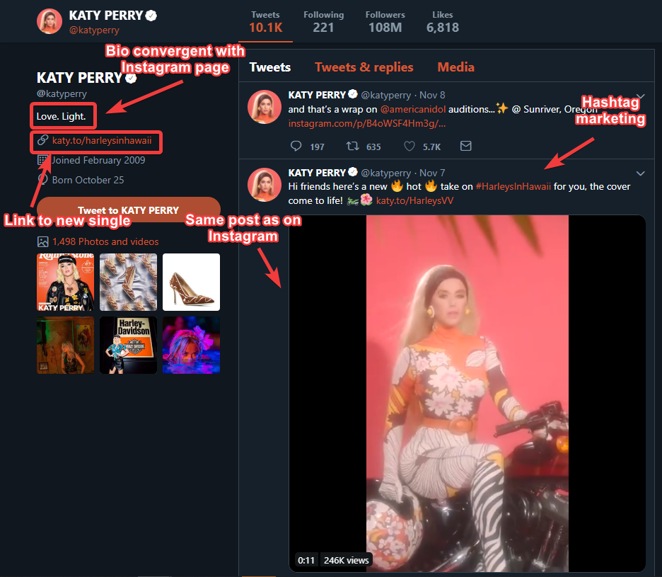
| Katy Perry's Twitter page |
My social media pages were Instagram and Twitter and featured content to ensure that there was convergence across both pages as well as links to my other media products. I did this by linking to my other media products on the social media pages and keeping the bio + profile pictures similar.
 |
| My Twitter promo for my autocomplete interview |
 |
| My Instagram promo for my autocomplete interview |
 |
| My Twitter profile |
 |
| My Instagram profile |


 I looked at the website for the popular singer: Khalid, for inspiration on my own website. The first thing you see on his site, similar to many other sites is a looping section of his latest music video with a link to go to it. He takes a section of his videos with some of the more energetic, fast moving shots as well as a few of him to give people just finding out about him an idea of who he is. The video has many cuts, is prominent, plays automatically and loops, meaning there is minimal effort for those on the site and they can engage with the video as soon as the site opens.


No comments:
Post a Comment