I did this practice shoot in order to get an idea of how easy it would be to film the actual shoot. We went about this by filming and editing with our phones. This overall made this version a lot more amateurish as well as many things in this version that weren't in the actual version, with a change in actors, settings and props across the trailers.
My first practice shoot advert
My second practice shoot advert
This was overall very beneficial to my final project with the things I did wrong helping with my final product such as me forgetting to buy real food the day before the shoots as well as helping me realise the importance of getting enough footage before and after a shot. I also had to learn to manage my time better in order to make sure all my shots were filmed the second time around as I wasn't able to film 2 of the shots in my test shoot. There were also many additions I realised my ad needed such as sound effects, better pacing, different shot order as well as the addition of the delivery process in one of my adverts.
I created my advert storyboard to give an idea of how my advert would look as descriptions can only show so much. I went about this by getting a large piece of A3 paper and sticking various post its on it, with each on representing a different shot. I then wrote the dialogue under each post it as well as character movement and camera movement on which ever shot it applied to.
I mainly referenced my storyboard and initial concept notes when creating my storyboard as these had my ideas already there. I looked at previous storyboards I had made in a similar fashion in order to get an idea on how I would lay out my own.
My first shootboard
My second shootboard
This was beneficial as it allowed me to see how each shot would be framed as well as the actions of those within the shot so I could better see how realistic my shots were when I really saw them drawn out. This all helped me frame my shots and direct my actors into their correct positions when it actually came to filming.
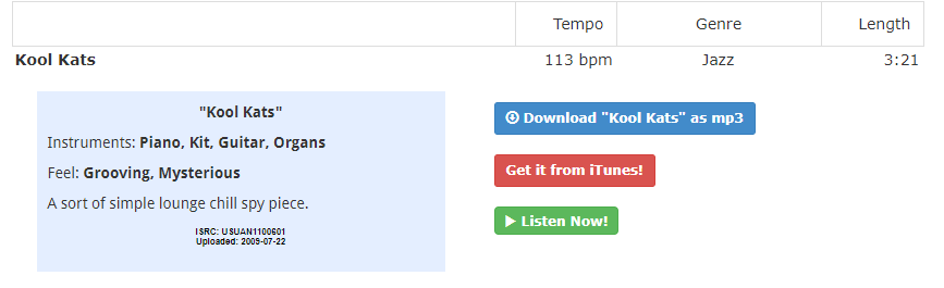
I used royalty free music for my advert, going to a source of quality, free and non-copyright music I already knew of: www.Incompetech.com. I found a piece of music that was fairly minimalist and light-hearted called "Kool Kats" and decided to use that for both adverts. The piece had no blaring instruments or lyrics that would distract from the voice over or dialogue in the advert itself.
The download page on Incompetech for my adverts music
Most of the sound effects such as the various "wooshes" were done by voice in order to make sure they were original where possible. For some sound effects, I found royalty free effects online after looking for a while to provide diegetic sound to my car startup and beeping scenes, something common to most of the adverts I had looked at to give the ads more energy. I also made sure when mixing the audio to turn all the music down and turn all the voices and sfx up to make sure the music wasn't to overbearing, as this was a convention true to all ads I saw. The voices in my trailer came purely from narration, I wrote my script for both ads beforehand as can be seen here:
The use voiceover in this way was due to other adverts I had seen which use narration and miming actors to create comedy such as in this McDonald's advert:
When making the branding I needed to make something that would be eye catching yet original. I initially thought about going for an icon however settled on a text logo, with an overall orange colour scheme. This was the plan I made for my various YourFood logos:
I designed the logo in Photoshop and used the Bulletto Killa font, I put an orange stroke and gradient effect on the text to make it look bright and stand out. This approach meant that the logo was completely designed by me, using no pre-existing images or logos to make my own. I based my logo on other modern, simplistic text based logos such as the oreo logo:
The style of logo I based mine on
My bright, vibrant colour scheme was based on the one for Europe based food delivery service: Takeaway.com.
The Takeaway.com logo
My Brand logo
I kept this branding consistent when designing the app UI in which i used a app design template but changed it to match my own vision. This meant adjusting the text colours and iconography on the app to make it entirely personalised to my ad; I made multiple different app screens for different parts of my advert. I made the branding consistent across both ads as well as on the prop food packaging for my advert to keep synergy across both. Both my adverts had very simple on screen text at the very end , subtitling the slogan of my brand: "all day, your way, YourFood".
I went through creating my advert timelines by getting an A3 piece of paper and sketching out 2 timelines on it in order to make a timeline of events when creating my advert storyboards. I had to decide how best everything flowed together as well as getting a rough idea on timing of shots so that everything fits into the 30 second ad time.
When designing the timeline I mainly looked at my already created simple voiceover and figured out how to plot it out onto my 2 timelines. I looked at my previously made timelines in the past in order to get more inspiration on how to design them effectively.
My timeline
This was overall very beneficial to my project as it showed me the importance of timing in these adverts as you must fit everything to a 30 second window. It also showed me the importance of a simple advert concept as I had to be able to describe all my shots clearly. This meant that when it came to drawing out my concepts it wasn't too difficult for me to draw.
When starting creation on my advert I decided I liked the idea of a voice-over lead advert from adverts such as the MoneySuperMarket adverts and so I decided I would do that. I wanted to come up with a unique concept surrounding this and made some notes on what I planned to do in order to get my basic idea down.
An advert with a comedic voice over in the same style I planned to do for my advert
At the start my idea seemed too long but I quite liked the concept. It was an advert focused on someone with an overall boring life who eats the same boring food every day but then goes into a scenario where his life is much more interesting and so is his food; until finally concluding with the fact he can't change everything in his life but he can spice up his food with YourFood.
I had a similar idea with my second advert which featured a couple who had a terrible day but then they redo the whole day, this time where everything goes right, until the advert finally says you cant go back in time but maybe they can do it right tomorrow.
These adverts proved much too long with the idea of going back and redoing the day in a better way meaning almost 2 ads had to be made in one 30 second ad space. Many things were changed but the general concepts of the man who has a boring life and the couple who had a bad day which is all improved by YourFood, stayed until the final product.
My idea always made sure to stick to the brief, with the planned use of 17 year old actors in situations that young people from ages 16-25 would all be able to relate to. I planned to have a similar theme across both adverts as well as consistent branding in order to create synergy between them and I planned to create a tagline which I would use for both adverts.I wanted to use the voice-over to create humour to engage the audience and make the adverts memorable.
I found this process helpful and they overall allowed me to create a fully fleshed out advert concept based on these ideas. I had not yet decided on my slogan, the exact voice over dialogue, my actors or my music but I had an idea created which I could work from.
I did this research in order to get more ideas for branding and other design ideas, as the idea of branding and graphic design in adverts is most prominent in print or other non moving advert forms as they take up a lot more of the readers attention. I found these adverts through google images as well as pictures I took myself.
All print adverts seem to have a focus on having a catchy tagline, subtitle or ad copy. This is done to engage the reader and put forward things such as humour or intertextuality despite having no dialogue, special effects or music to do so. This means that these must carry the message of the advert extremely effectively and concisely. However the use of colour and focal image is also a priority with this being the only thing that can be added to the poster to make it stand out other than text. This means graphic design is much more important as there are no moving images or other parts to take the readers attention. I thought the Just Eat 'still having a job after doing "that thing" at the Christmas party' ad was very effective in showing this concept. The ad copy is purposefully ambiguous to allow the reader to come up with their own possible idea of what it was that happened and so the advert is able to communicate an inappropriate idea of what they may have done without being explicit about it. This is helped by the shocked looks on the faces of those in the advert who are all looking at something off screen, to again allow the audience to fill in their own interpretation of what happened. The use of colour also shines through in this ad with the consistent red colour scheme clearly being used to create branding and show that this is a Just Eat advert.
The print adverts I found
The interesting conventions for still adverts are useful especially with intertitles and end cards which are effectively stationary adverts within a moving one. However the focus on design and slogans will be helpful overall when it comes to working on both branding, slogans and general dialogue of my adverts.